Laundry Knights
Team Members
Stella Thompson, Clark Glymph, Eva Cao, Harry Xun
Project Overview
Laundry at Carleton is tough—finding an available machine, setting a timer, and hoping no one interferes with your load. Once the wash is done, you rush back, hoping for an open dryer, but delays often force us to wait or take wet clothes back to our dorms. A laundry tracking system would benefit both students and staff managing these spaces.
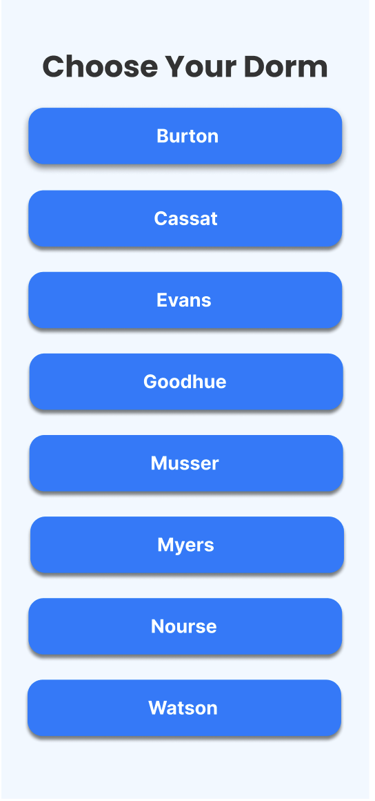
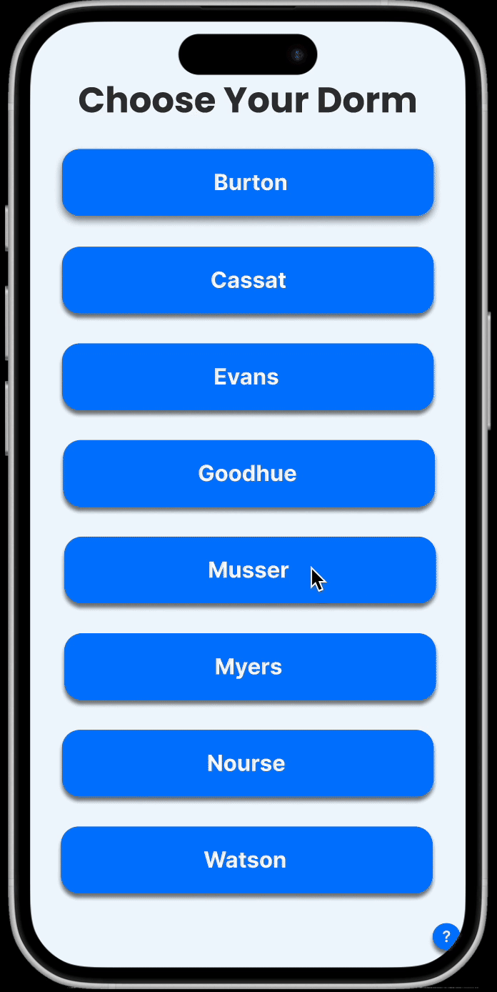
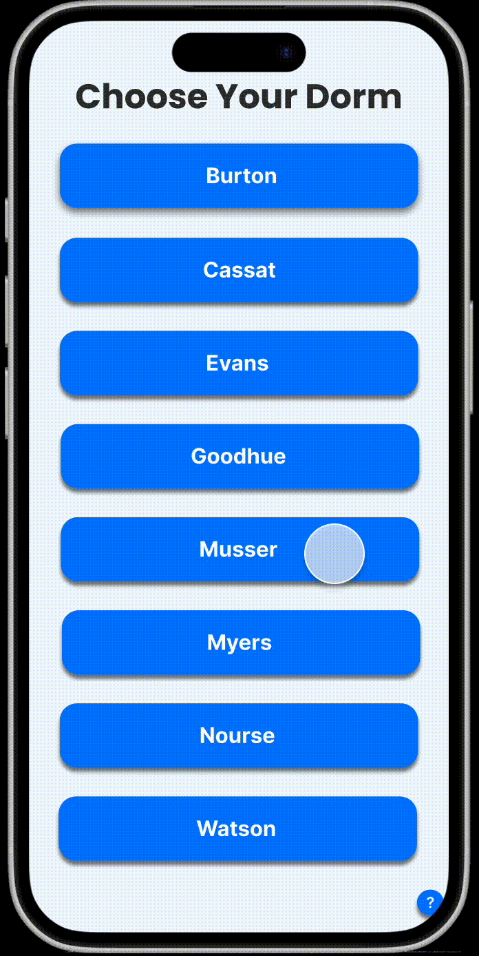
Dorm Selection Page
Homepage when user is not using any machine
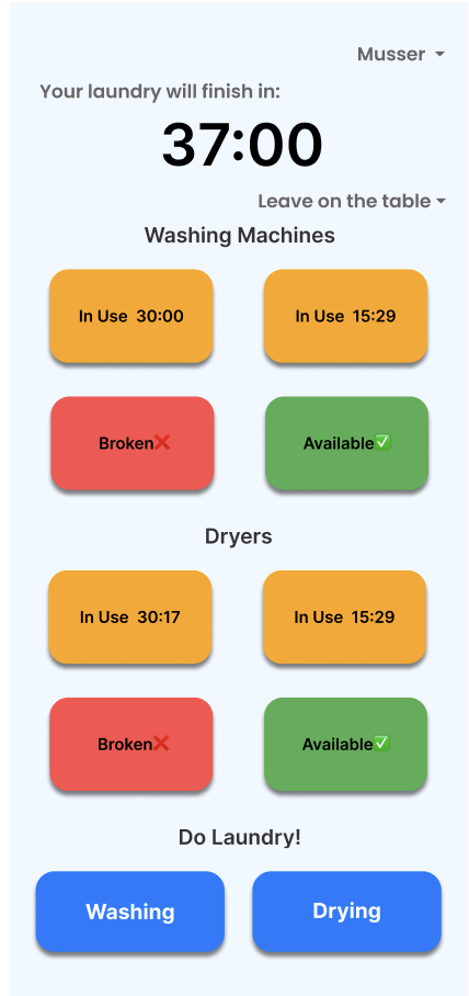
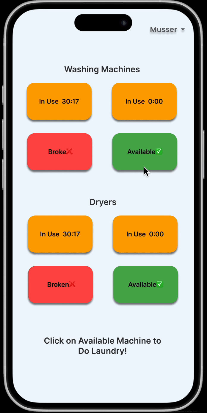
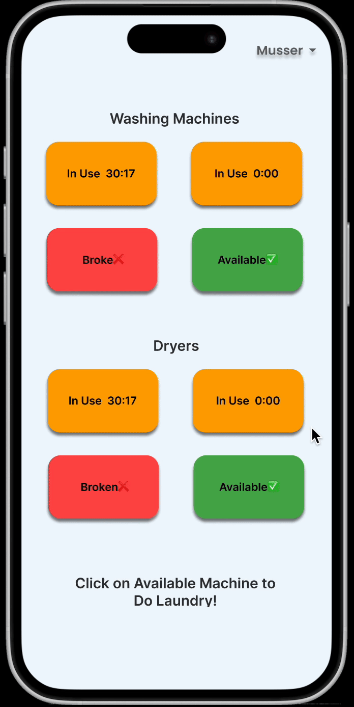
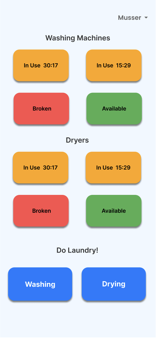
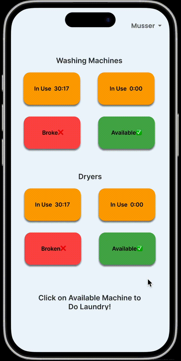
Homepage when user is using machines
Prototype Description
Through interviews with users, we discovered that users primarily want to know whether there are available machines in their dorm building and how much time remains for their laundry cycle to complete. Based on these user needs, I developed a simple system prototype. The first page serves as the initial interface where users select their dorm building. Once selected, users are directed to the second screen, which presents a clear and visually intuitive display of available machines in their building. When a user clicks on a machine to start a cycle, the interface transitions to the third screen, featuring a prominently displayed timer to keep them informed of the remaining time.
Final Three Requirements
- Requirement 1: View Available Machines A system to keep track of available machines in the facilities makes for less labor and stress for users in the laundry rooms.
- Requirement 2: Keeping Track of Laundry Setting a timer both helps the user keep track of their laundry within the machines and lets other users also know when machines might be available next.
- Requirement 3: Avoiding Conflicts Providing clear options and communication tools reduces potential conflicts or frustration over laundry handling in shared spaces, ensures users' preferences are respected while improving efficiency
UX Research Process
We designed a detailed semi-structured interview protocol with a question list, and a fictional inquiry protocol. We then conducted two semi-structured interviews and three fictional inquiries, collecting a total of two hours of audio recordings and 40 pages of transcripts. In all five interviews, participants mentioned the three requirements we identified, highlighting their significance for laundry users.
Analysis Process
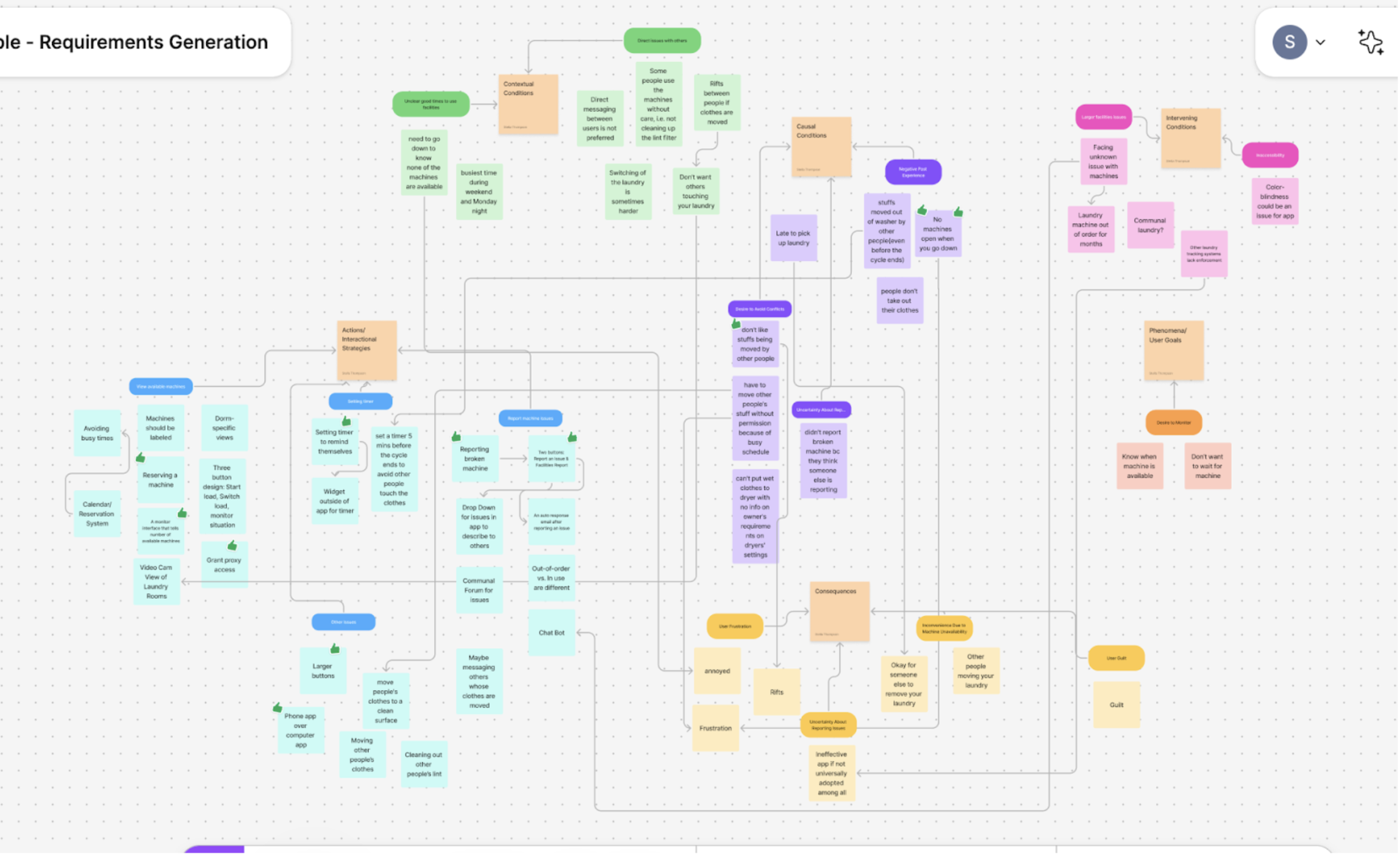
After completing the interviews and transcriptions, we assigned two team members to analyze each transcript, identifying key points and summarizing them using an axial codebook for classification. Following this, we used Figma sticky notes to organize and analyze the different codes, creating an affinity diagram as shown in the figure below. Through multiple rounds of discussion, we ultimately identified the three most important requirements.
My Prototype
Description
This is the interaction flow for viewing available machines. The user first selects their dorm building, and then the availability of each laundry machine is displayed directly on their phone. The status of each machine is clickable, allowing users to explore more details and access additional features. Additionally, a dorm selection option is placed in the top right corner to improve error tolerance.
How It Addresses Requirement
Users want to minimize the effort and time required to find an available machine, and my interface is designed with this in mind. With just a quick glance at a few words, users can locate their dorm, tap a button, and instantly see the machine status—all within two seconds. The status display is also designed for clarity. By using large text and strong color contrasts, users can quickly differentiate between machine statuses, ensuring that their needs are met efficiently.
Description
This is the interaction flow for Keeping Track of Laundry. On the checking status page, users can tap on any available machine, which will trigger a “Do Laundry” prompt. Once tapped, the system redirects the user to the laundry settings interface, where they can select the wash duration and preferred laundry settings. After clicking “Start”, the system begins a countdown timer.
How It Addresses Requirement
Users want their laundry progress to be clearly trackable, and my design emphasizes this by placing the timer in the most prominent position. Additionally, the slider interface simplifies the user’s effort in setting up their wash cycle. Moreover, as seen in the previous interaction flow, anyone can quickly check how much time is left for a running laundry cycle. This effectively meets the users' needs.
Description
This is the interaction flow for Avoiding Conflicts. On the checking status page, users can tap on any in-use machine, triggering a prompt informing how the owner of the clothes would like to handle the clothes inside. Once the in-use timer reaches zero, tapping the prompt confirms that the user has properly handled the previous load, making the machine available again. Additionally, when doing their own laundry, users can use a slider to pre-set how their clothes should be handled once the timer expires.
How It Addresses Requirement
Through interviews, I found that most users prefer not to communicate directly via text but would rather use a system-generated tag instead. To accommodate this, I designed a simple slider that streamlines communication while ensuring that every user properly handles previous loads before starting their own laundry. By enforcing this confirmation step, the system helps prevent potential conflicts.
Link to my mid-fidelity prototype: Open Figma Prototype